

Now that you’ve learned how to create primary and secondary colors with PRSM powders, it’s time to complete the color wheel by mixing tertiary colors. These shades are where creativity and subtlety shine, giving you a broader palette to work with for your cookie designs.
What Are Tertiary Colors?
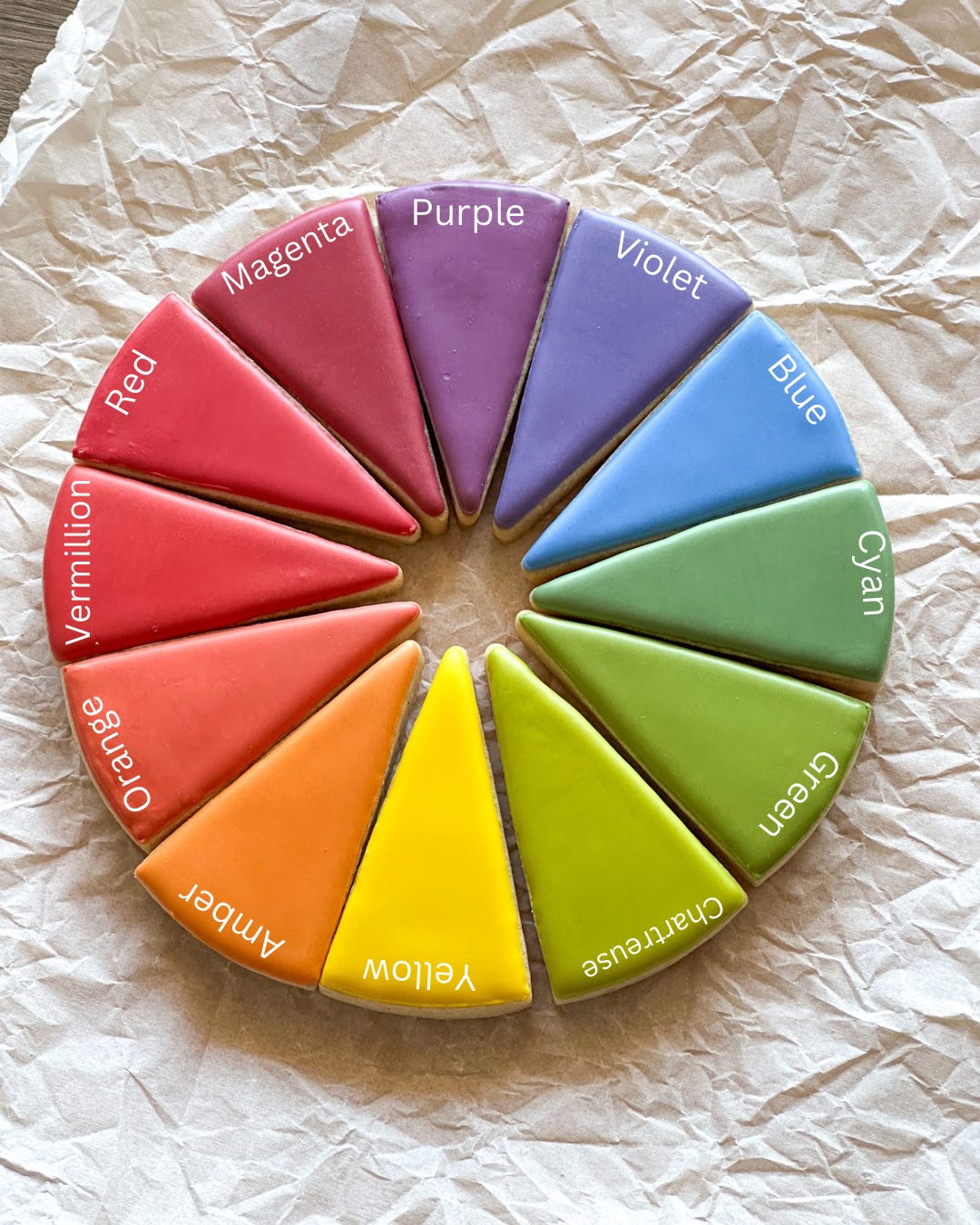
Tertiary colors are created by mixing a primary color with an adjacent secondary color in equal parts. These shades sit between primary and secondary colors on the expanded color wheel. Using PRSM’s ‘Red,’ ‘Sky Blue,’ and ‘No Fade Yellow,’ I mixed my tertiary colors as follows:
1. Magenta = Red + Purple
2. Vermilion = Red + Orange
3. Violet = Blue + Purple
4. Cyan (Teal) = Blue + Green
5. Chartreuse = Yellow + Green
6. Amber = Yellow + Orange
Each color was made using equal parts icing dyed with the secondary colors I created in Lesson 3. They can however also be created using equal amounts of powder, for example Amber would be 2 parts yellow, 1 part red. These tertiary shades are more natural and refined, perfect for elevating your cookie designs.
Why Use Tertiary Colors?
Tertiary colors allow you to:
• Add depth and complexity to your designs.
• Match specific themes or seasons (e.g., vermilion for coral tones, chartreuse for spring greenery).
• Create custom palettes that feel unique and intentional.
These shades are also ideal for natural dyes, as they tend to complement the softer, less synthetic look of PRSM powders.
How to Mix Tertiary Colors with PRSM Powders
Here’s the step-by-step process:
1. Start with Pre-Mixed Secondary Colors: Use the secondary colors you created in Lesson 3 (e.g., Orange, Green, Purple).
2. Mix in Equal Parts: Combine one part of a secondary color with one part of a primary color. For example:
• To make Amber, mix equal parts of icing dyed with ‘No Fade Yellow’ and ‘Orange’ (Yellow + Red).
• For Violet, mix equal parts of ‘Sky Blue’ and ‘Purple’ (Blue + Red).
3. Swatch and Compare: Note any variations based on the icing type or powder quantity.
Practical Exercise: Swatch Your Tertiary Colors
Use today’s lesson to practice creating and documenting tertiary colors. To help, I’ve created a downloadable Color Swatching Worksheet with spaces for each tertiary color and room for notes. Swatch your colors with a plastic sheet or parchment overlay onto the worksheet to reference later.
Examples of Tertiary Colors in Action
Here’s how you might use tertiary colors in your designs:
• Magenta: Perfect for vibrant florals or playful Valentine’s designs.
• Vermilion: Great for coral or peach accents.
• Cyan (Teal): Works beautifully for ocean-themed sets or winter designs.
• Amber: Perfect for warm, autumnal cookies.
• Chartreuse: A fresh, lively green for spring or summer foliage.
• Violet: Adds richness and elegance to floral or regal designs.
We are really getting to the good stuff now, our color wheel is complete. Next we’ll look at warm vs cool colors, it’s going to be great.